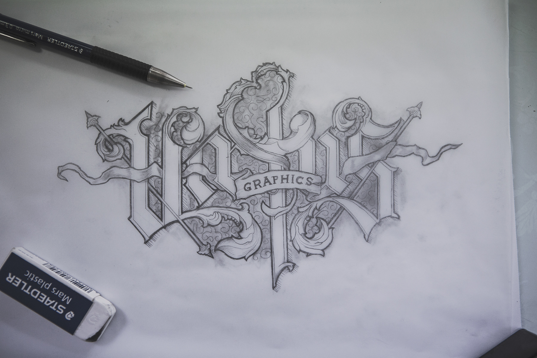
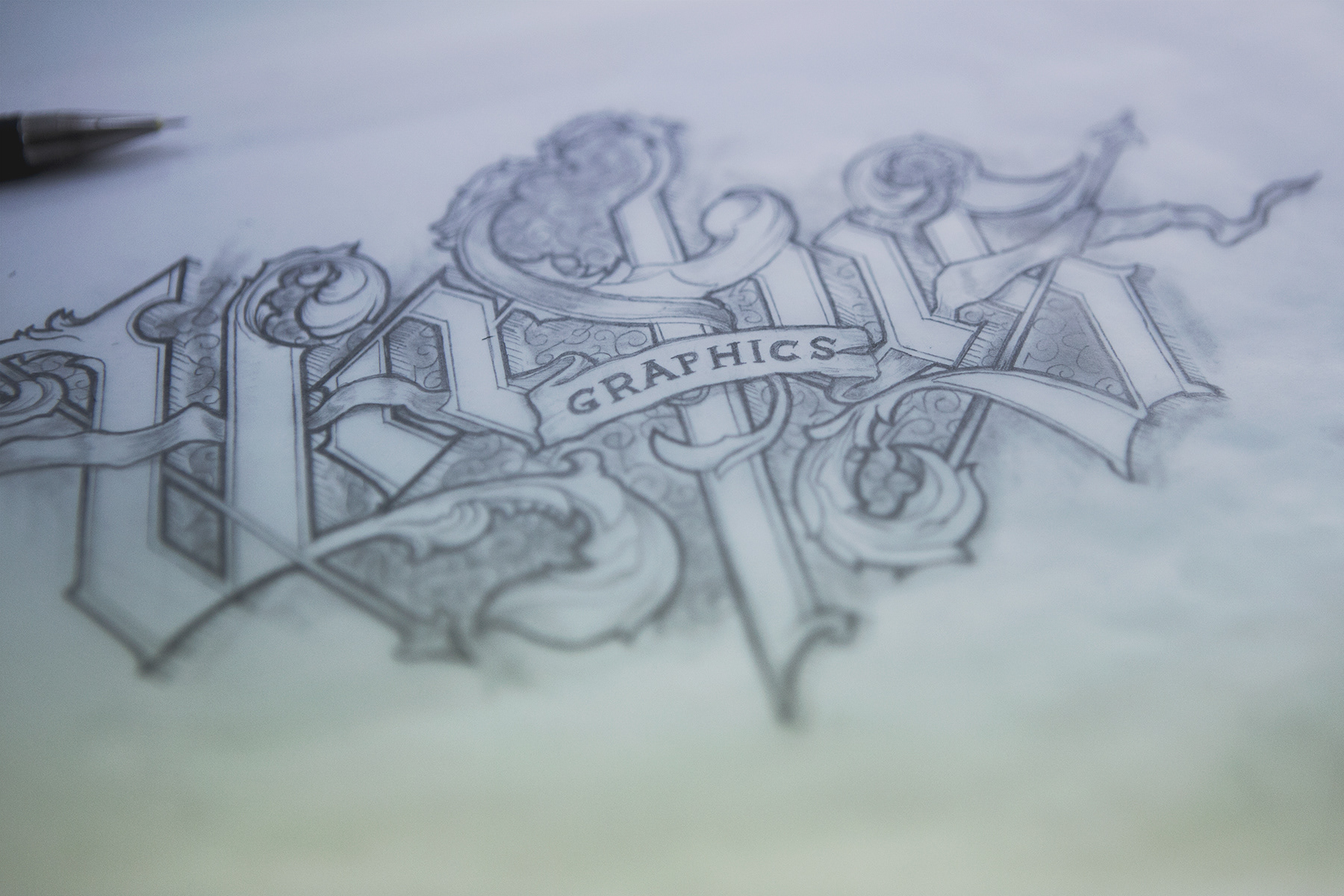
In an attempt to push my limits a little further I learned a few things that makes the artwork "pop" more. The end result was decent, and the letters I think turned out okay (not so much the other stuff around). This is one of my first times making proper blackletter-style, and it's pretty fun!
It was a bit of a needlework using a 0.3 mm mechanical pencil throughout the process. This thin and sharp pen often leave marks in paper, which means that even if you manage to erase the line entirely (which is pretty hard in tight spaces), there would be some kind of emboss left from it.
However, due to it thinness, it also allows me to constantly work with super-fine details without having to take a little break and sharpen it. As a person who loves to work with details, having one of the thinnest possible pens let me focus on just that without any need to break concentration.
With this paper however (tracing paper: Folia Paper, A4 80g/m2) it was a suprisingly pleasent experience. I have only in the past used baking paper for tracing something as it's cheap and gets the job done. Having a new block of paper made for this made fixing errors so much easier.
If there's anything I recommend when it comes to gear, here's what i am pretty pleased with: